
The problem usually isn’t the quality of the product. It’s the mismatch between the covering on the bed, the surrounding elements, and the overall design intent. A well-chosen bed covering doesn’t just “dress” the bed—it anchors the entire room. It connects the wall color, flooring, lighting, and furniture into one cohesive visual story. This guide breaks down how to actually get it right—without overcomplicating things.
Why the Covering on Bed Matters More Than You Think
The bed is the largest visual element in most bedrooms. That means whatever you place on it becomes the focal point instantly.
A poor choice can:
- Make a room look cluttered
- Clash with wall colors
- Highlight flaws in furniture or flooring
A smart choice can:
- Tie the entire design together
- Make a small room feel bigger
- Add warmth or contrast without renovation
Think of it this way: your bed covering acts like a “bridge” between all other elements.
Understanding Different Types of Bed Coverings
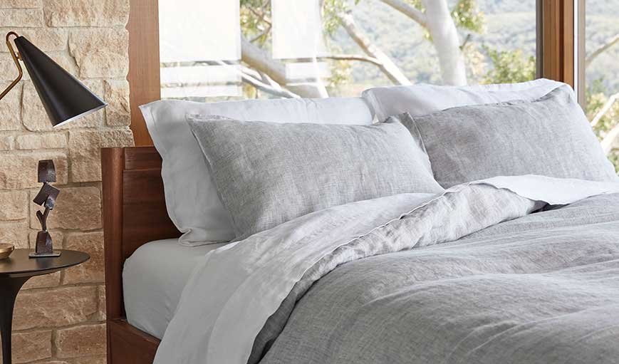
Quilts vs Comforters vs Duvets
Each option creates a different visual weight:
- Quilts: Light, structured, great for minimalist or layered looks
- Comforters: Fluffy, casual, works well for cozy setups
- Duvets: Flexible and stylish, ideal if you like changing covers seasonally
If your room already has strong colors or textures, go lighter. If it feels empty, go heavier.
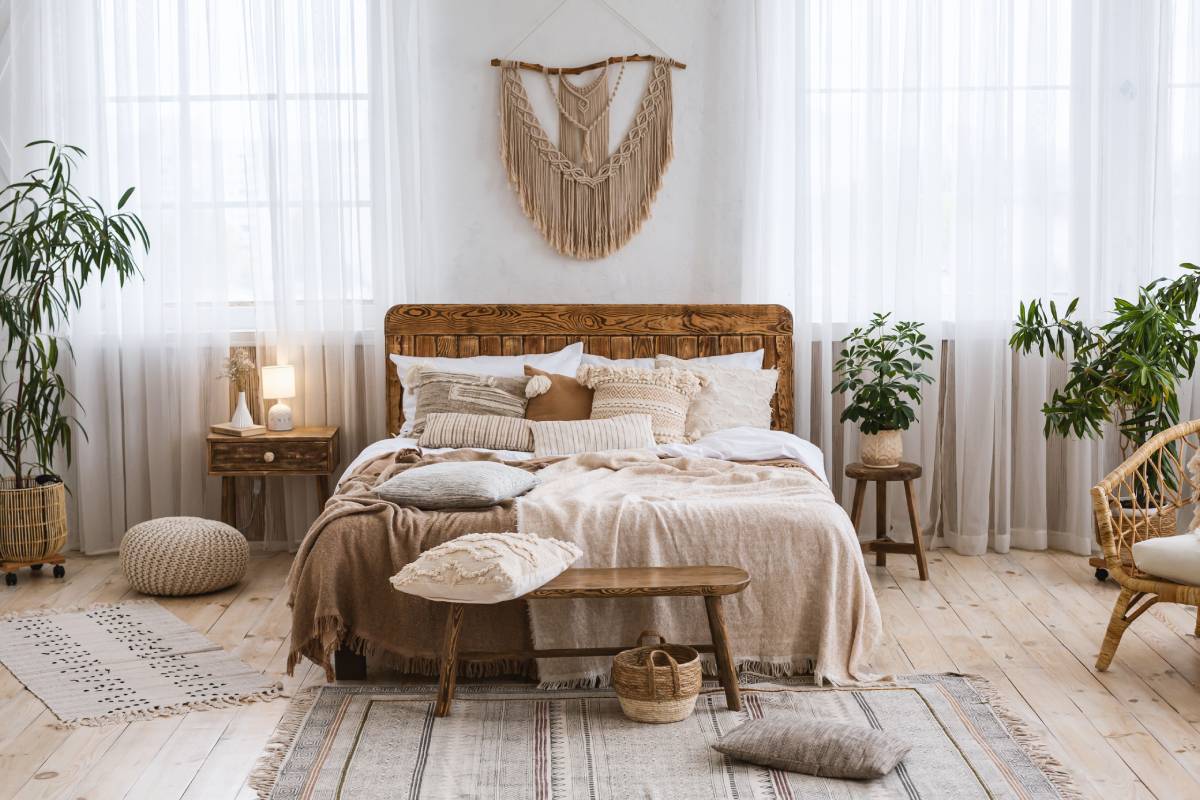
Layering: The Detail Most People Miss
A flat bed rarely looks finished. Layering adds depth.
Try this:
- Base layer: neutral sheet
- Middle layer: quilt or light blanket
- Top layer: main covering on bed
- Accents: cushions or throws
This approach works even in small rooms—it just needs proportion control.
Choosing the Right Colors for Covering On Bed (Without Guesswork)

Color decisions are where most people go wrong.
Match vs Contrast
You don’t always need matching tones. In fact, contrast often works better.
Example Setup:
- Walls: Soft beige
- Bed covering: Deep charcoal
- Accents: Warm wood + muted gold
This adds visual interest without chaos.
Using Trending Paint Colors Smartly
Some paint colors naturally pair well with bedding.
- iron ore color (deep charcoal tone): works beautifully with crisp white or warm beige bedding
- benjamin moore black forest green: pairs well with cream, tan, or muted gold textiles
If your walls are bold, your covering on bed should calm things down—not compete.
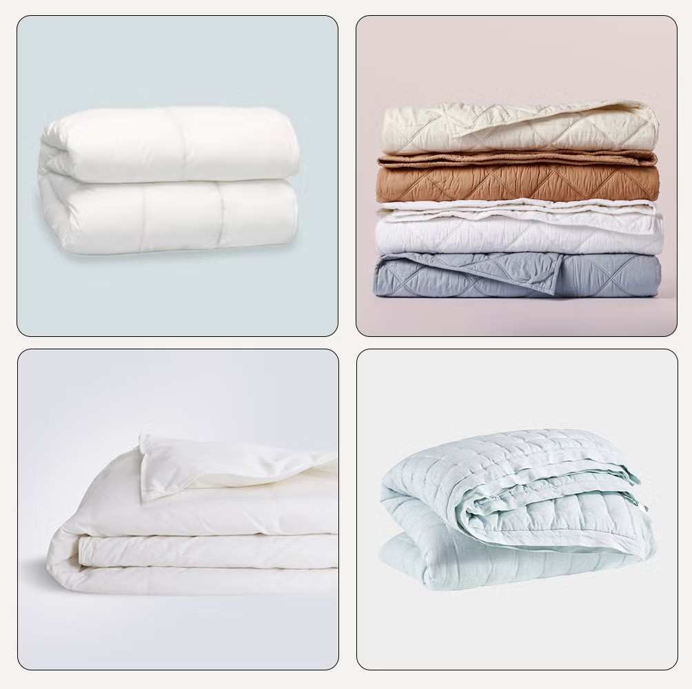
Fabric Matters: Texture Changes Everything
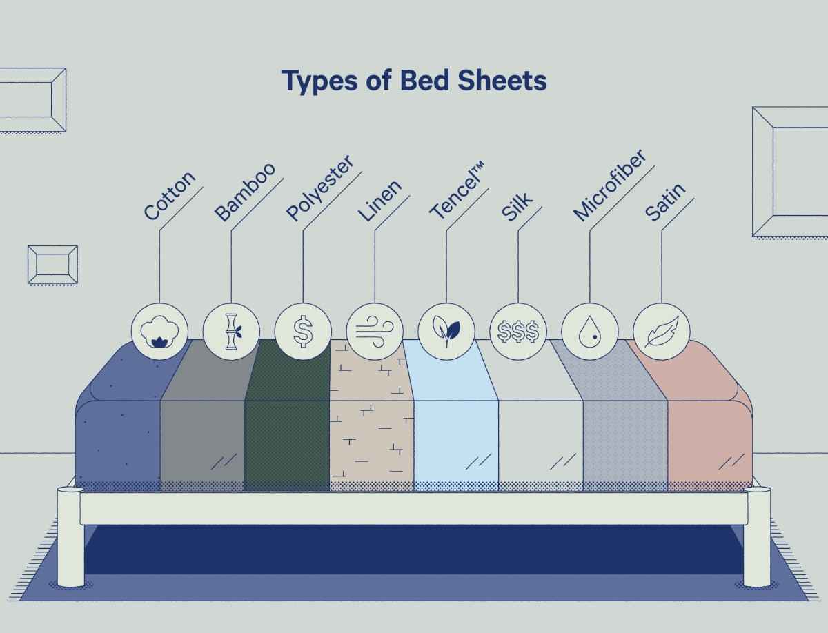
Even with the right color, fabric can make or break the look.
Common Options
- Cotton: breathable, clean, casual
- Linen: relaxed, slightly wrinkled aesthetic
- Velvet: rich, formal feel
- Microfiber: budget-friendly but less premium
Practical Tip
If your room has:
- Smooth surfaces → add texture (linen, quilted cotton)
- Heavy textures → simplify (flat cotton, clean lines)
Balance is key.
Bed Skirts: When to Use Them (and When to Skip)
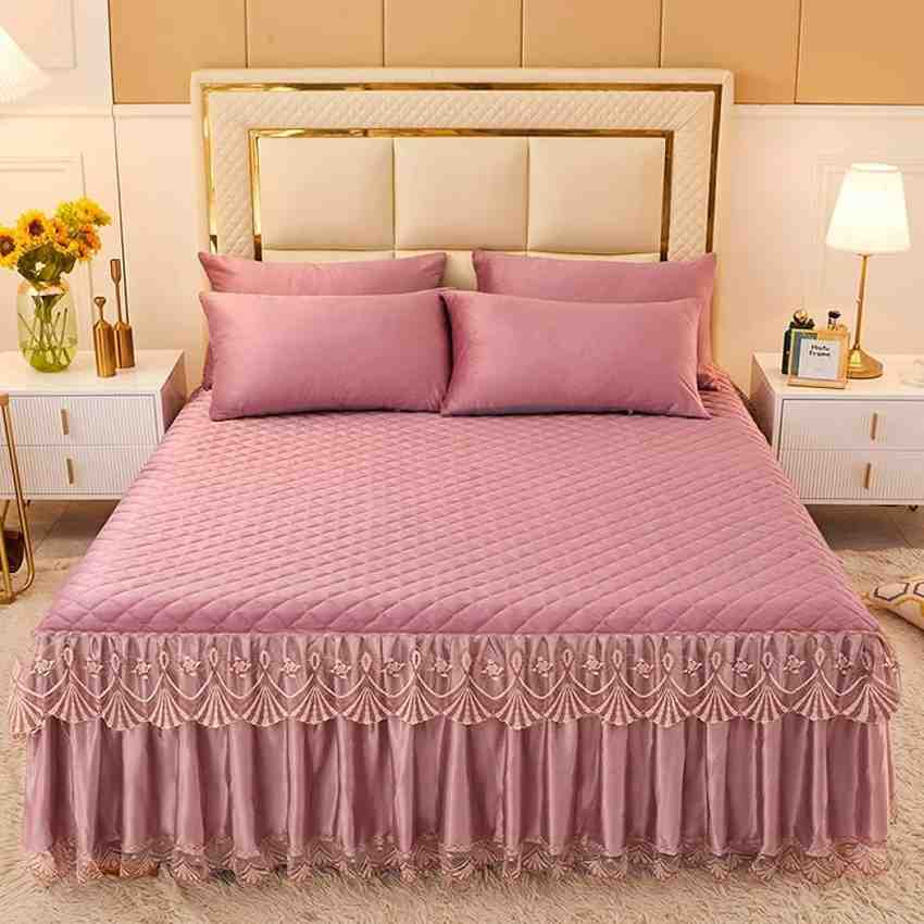
A skirt on the bed is not just decorative—it solves practical problems.
When It Works
- You have under-bed storage
- Your covering on bed frame looks unfinished
- You want a more polished, hotel-like appearance
When It Doesn’t
- Platform beds (low height)
- Modern minimalist designs
- Small rooms where extra fabric adds visual weight
Special Case: Nursery Styling
A skirt for a crib can hide storage bins or create a softer look in a nursery.
Keep it:
- Light in color
- Easy to wash
- Not overly layered
Avoid heavy fabrics—they collect dust and complicate cleaning.
Coordinating with Flooring: The Carpet Connection
People often ignore how bedding interacts with flooring.
Best Carpet Pairings
Choosing the best carpet depends on contrast and tone.
Example Combinations:
- Light carpet + dark bedding → strong contrast
- Dark carpet + neutral bedding → calm and grounded
- Patterned carpet + simple bedding → avoids visual overload
What to Avoid
- Matching exact colors (looks flat)
- Too many patterns competing at once
Your bed should stand out—but not scream.
Wall Details That Affect Your Bed Styling

The Role of Trim and Molding
Details like painting molding white can subtly elevate your room.
White trim:
- Frames the darker walls beautifully
- Makes bedding colors pop
- Adds structure without effort
Real Example Setup
- Walls: Black forest green
- Molding: White
- Bed covering: Cream quilt
- Carpet: Light beige
Result: clean contrast, balanced tones, and a calm visual flow.
Real Bedroom Design Combinations That Work

1. Modern Neutral Setup
- Walls: Warm gray
- Bed: Soft white covering
- Accents: Black cushions
- Flooring: Medium-tone carpet
Simple, timeless, easy to maintain.
2. Bold Contrast Room
- Walls: Deep charcoal (iron ore tone)
- Bed: Beige textured fabric
- Trim: White
- Flooring: Light carpet
Strong contrast but still comfortable.
3. Earthy Green Theme
- Walls: Dark green
- Bed: Linen in off-white
- Wood furniture: Natural oak
- Accents: Brass or gold
Works well in both large and small spaces.
Common Mistakes to Avoid

1. Choosing Style Over Function
A beautiful covering on bed that’s hard to clean or uncomfortable won’t last.
2. Ignoring Room Lighting
Natural light changes how colors look. Always test shades before finalizing.
3. Overloading Textures
Too many materials can feel chaotic. Limit to 2–3 main textures.
4. Matching Everything Perfectly
Rooms need variation. Slight differences create depth.
5. Using Oversized Patterns
Large prints can overwhelm smaller rooms quickly.
Practical Tips That Make a Real Difference
- Stick to a color palette (3–4 tones max)
- Use cushions to test colors before committing
- Rotate bedding seasonally (lighter in summer, heavier in winter)
- Invest in one high-quality layer instead of multiple cheap ones
How to Adjust the Bed Based on Room Size

Small Rooms
- Use lighter shades
- Avoid heavy layering
- Keep patterns minimal
Large Rooms
- Add texture and layers
- Use darker tones for grounding
- Mix materials carefully
FAQ Section
1. How often should I change my bed covering?
Ideally, every season. This keeps the room fresh and adapts to temperature changes.
2. Can I mix patterns on my bed?
Yes, but limit it to two patterns max. Balance them with solid colors.
3. What color bed covering works in any room?
Neutral shades like white, beige, or soft gray are the safest choices.
4. Is a bed skirt necessary?
Not always. It depends on your bed style and whether you need to hide storage.
5. How do I match my covering on bed with the wall colors?
Use contrast instead of exact matches. If walls are dark, go lighter on bedding and vice versa.
6. What’s the easiest way to upgrade a bedroom quickly?
Start with the bed. A well-chosen covering and a few cushions can transform the entire space without major changes.
Conclusion
Choosing the right covering on bed isn’t about following trends. It’s about understanding how different elements interact—color, texture, light, and scale. When done right, your bed becomes more than just furniture. It becomes the centerpiece that brings the entire room together without trying too hard. Focus on balance, stay practical, and avoid overcomplicating decisions. That’s where most people go wrong.